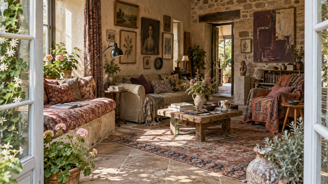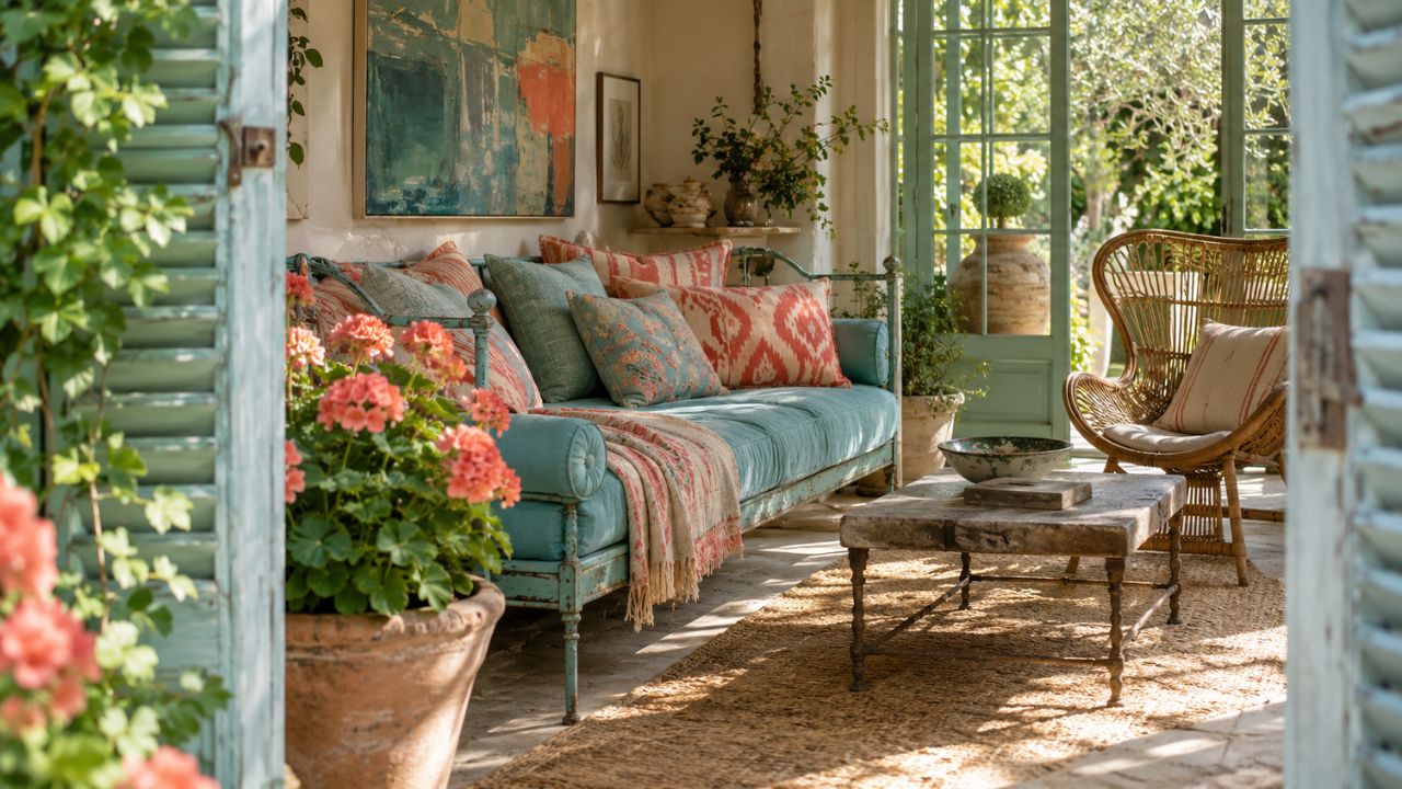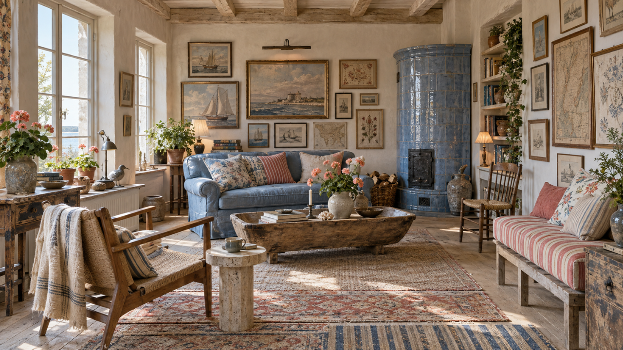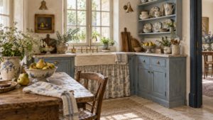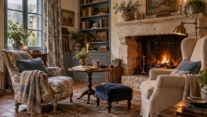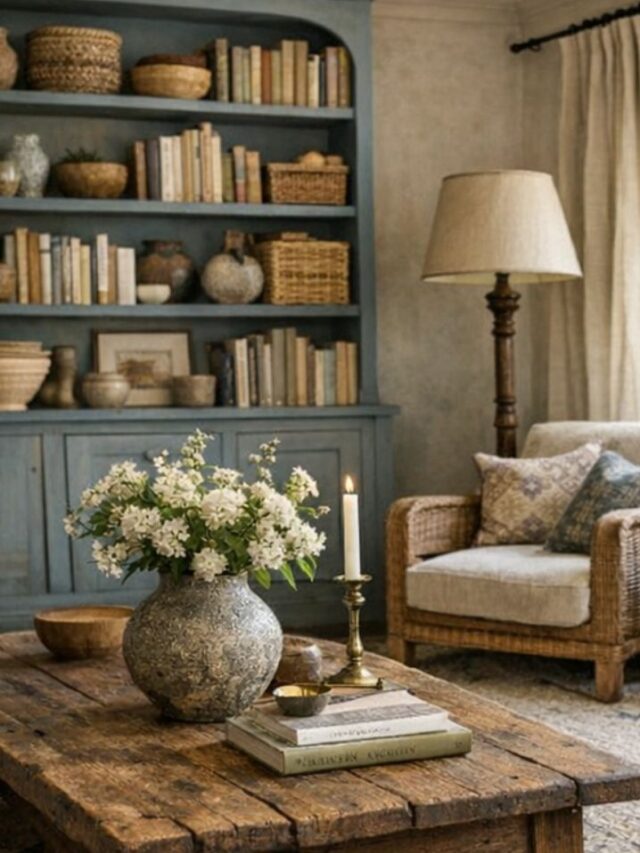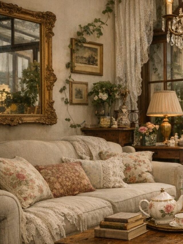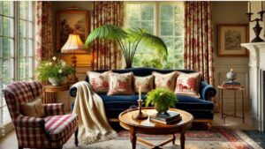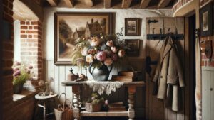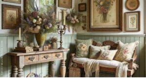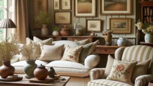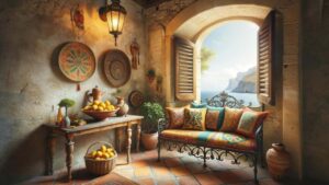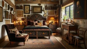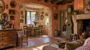
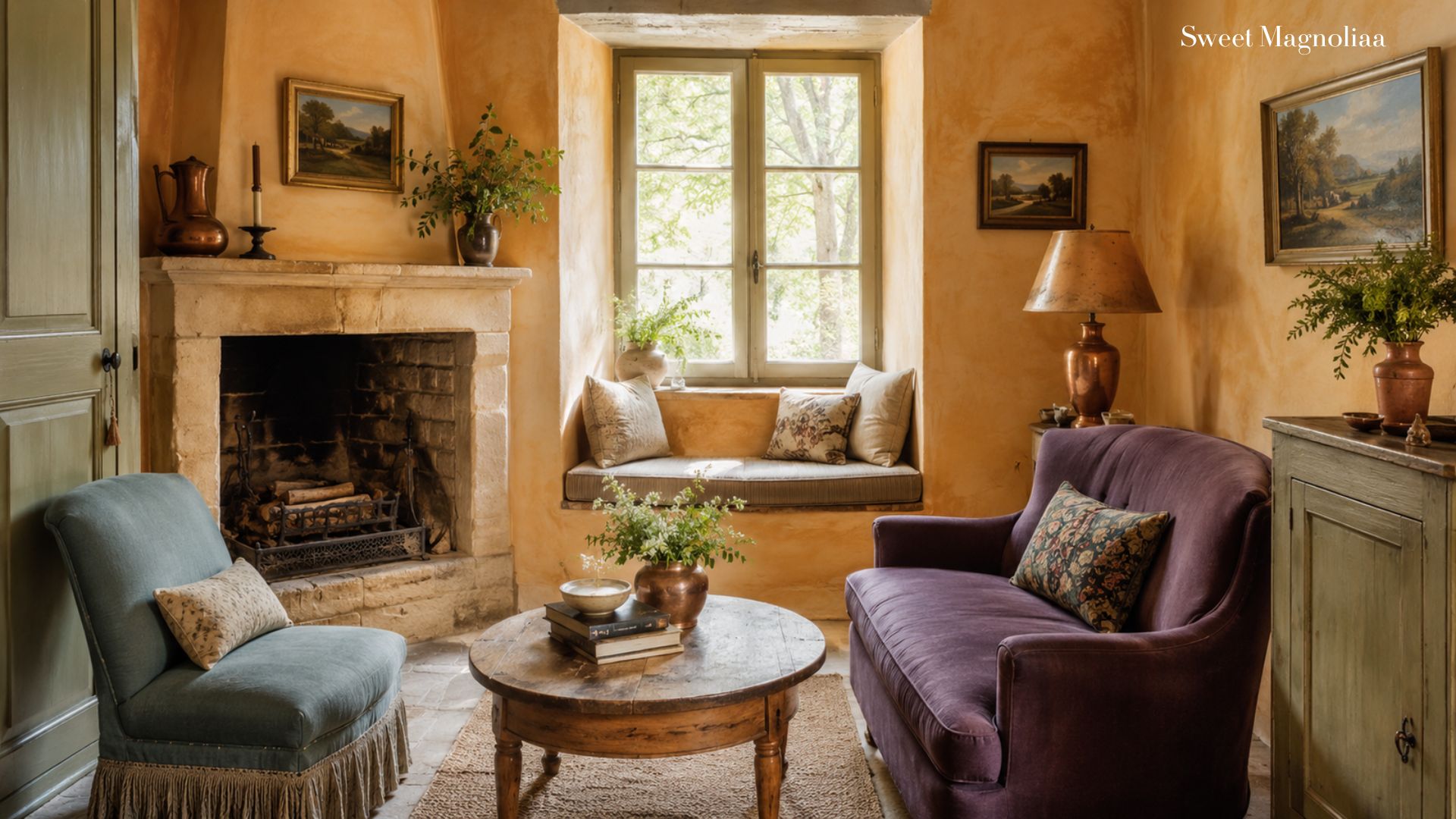
Sage green feels almost made for French cottage interiors. It’s soft, botanical, slightly faded — beautiful beside linen, stone and old wood.
But French cottage color goes far beyond sage.
Look at the countryside and you’ll find dusty blue shutters, warm ochre stone, faded roses, lavender-grey skies, olive leaves, terracotta earth, and dark weathered timber. And then there are the smaller colors — the antique brass, burgundy, plum, copper and blackened iron — that give a room its depth.
Today we’re exploring seven nature-inspired French cottage palettes, including the accent colors that make each one feel layered, warm, and collected.
1. Dusty Blue, Warm White & Weathered Wood
Accents: Antique Brass + Muted Burgundy
Think of old blue shutters, faded by decades of sun.
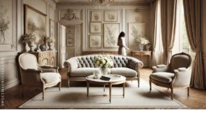
French cottage blue shouldn’t feel crisp or coastal. Choose a dusty blue softened with grey, then surround it with warm whites — ivory, chalk, cream, and old plaster.
Weathered wood grounds the palette. Bring it in through a farmhouse table, a rustic bench, or an antique chest.
Then add the accents. Antique brass brings warmth through candlesticks, hardware, lamps, or an old mirror. Muted burgundy adds unexpected depth — a faded floral cushion, an antique rug, old books, or dark red flowers.
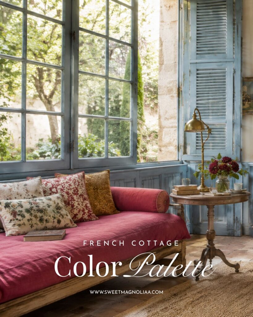
Keep the burgundy subtle. Just enough to keep the blue and white from feeling overly pretty.
2. Muted Olive, Linen & Soft Stone
Accents: Aged Terracotta + Blackened Iron
If you love sage but want something a little deeper, move toward olive.
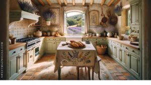
Muted olive carries more earth in it, and it looks beautiful against limestone, natural linen, and weathered wood. Use it on cabinetry or a vintage cupboard, then layer in flax, oatmeal, cream, and warm stone.
Add aged terracotta through old pots, tiles, or ceramics — its warmth balances the green beautifully. Finish with small notes of blackened iron: a chandelier, a curtain rod, cabinet handles, or a lantern.
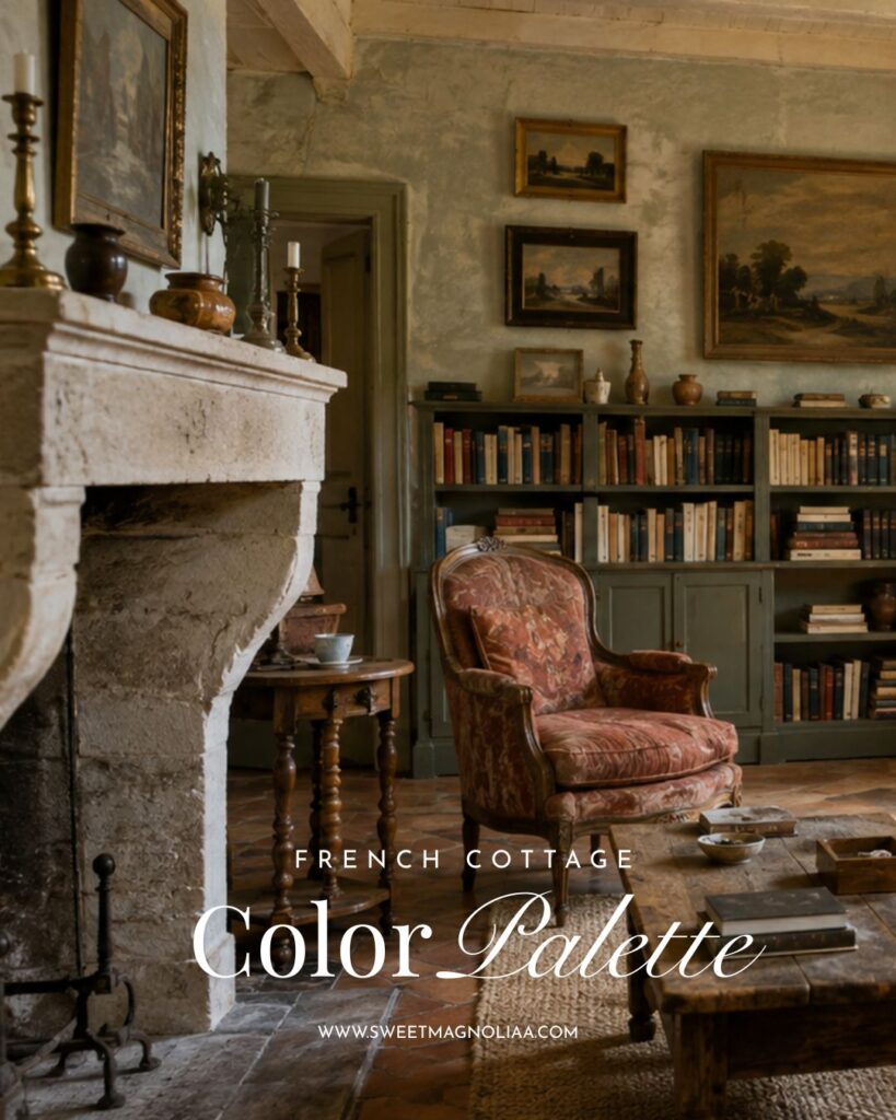
Olive creates softness. Terracotta adds warmth. Blackened iron gives the palette its definition.
3. Warm Ochre, Cream & Terracotta
Accents: Olive Green + Aged Copper
This palette takes its colors from late-summer fields, dry grasses, and sun-warmed stone.
Choose earthy ochre rather than bright yellow, and use it through linen, upholstery, an antique textile, or gently washed walls. Cream gives the room breathing room, while aged terracotta brings the earth indoors through pottery and flooring.
Then introduce olive green — a botanical branch, a vintage landscape, a cushion, or a painted stool is enough to create contrast within all that warmth. Finally, aged copper adds patina: think old pans, vessels, or a small lamp.
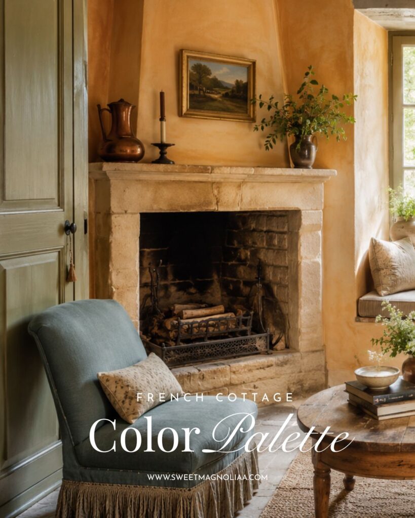
Ochre gives you sunlight. Terracotta gives you earth. Olive brings in the landscape. Copper gives the whole palette age.
4. Faded Rose, Mushroom & Antique Cream
Accents: Dusty Sage + Antique Gold
French cottage pink should feel as though it has already lived a long life — think faded roses and antique floral fabrics rather than fresh pastel pink.
Use faded rose sparingly, in a quilt, an armchair, a rug, or a floral curtain. Ground it with mushroom — a sophisticated brown-grey neutral — and soften everything with antique cream.
Let sage become an accent rather than the main event. A little greenery, a piece of botanical artwork, or sage hidden inside a floral textile is enough. Add antique gold through a frame, a mirror, or a lamp.
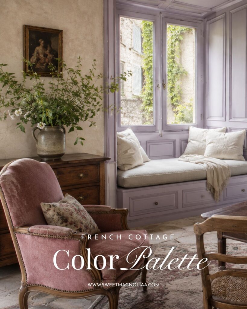
Rose brings the romance. Mushroom keeps it earthy. Sage connects it to the garden, and aged gold gives everything a gentle glow.
5. Lavender Grey, Chalk White & Walnut
Accents: Muted Plum + Aged Brass
Lavender belongs naturally to the French landscape, but indoors it becomes more sophisticated when softened with grey.
Lavender-grey changes beautifully with the light. Pair it with chalky white and rich walnut furniture to give the delicate color more weight. Then deepen the palette with muted plum — used very little, in a faded rug, a floral print, a velvet detail, or a dark flower.
Finish with aged brass through a reading lamp, drawer pulls, or candlesticks. The walnut and plum keep the lavender from turning overly sweet, while the brass brings warmth back into the room.
This palette is especially beautiful for bedrooms and reading corners.
6. Earth Brown, Soft Black & Natural Linen
Accents: Oxidized Green + Deep Oxblood
French cottage doesn’t always need to be pale. Nature gives us dark timber, earth, moss, shadow, and deep berries too.
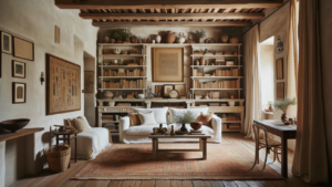
Build this palette around dark weathered wood, earth brown, and soft black — reaching for charcoal and blackened iron rather than sharp modern black. Then soften everything with natural linen: loose curtains, cream upholstery, flax textiles.
For the first accent, bring in oxidized green — mossy ceramics, aged copper patina, or deep muted foliage. Then add the smallest touch of oxblood, through an old leather chair, a book, a rug, or a textile.
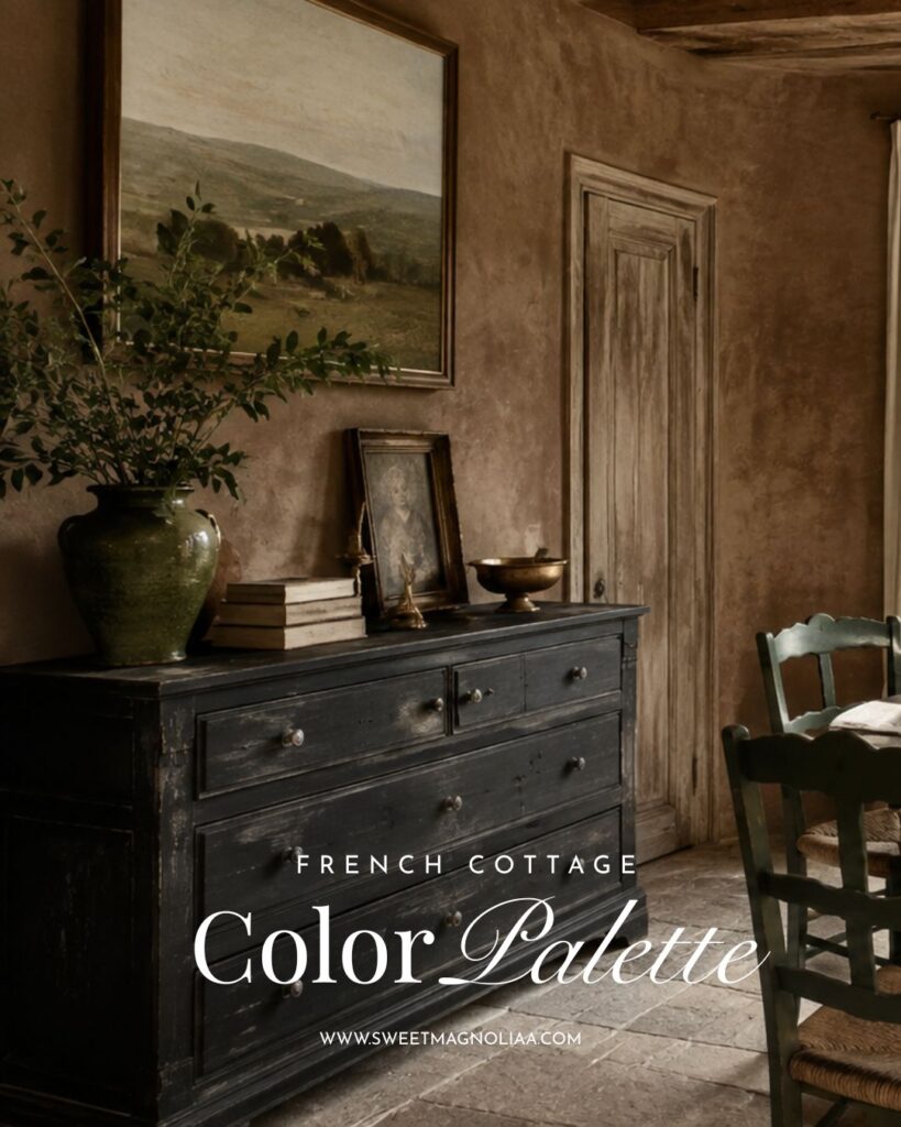
These accents give a darker cottage room extraordinary depth, without ever making it feel heavy.
7. Terracotta, Dusty Blue & Olive
Accents: Warm Cream + Antique Brass
Our final palette combines earth, sky, and foliage.
Begin with terracotta, through old flooring, pottery, or ceramics. Add dusty blue through painted furniture, textiles, or vintage ceramics, then bring in muted olive through plants, upholstery, or a small cupboard. Because all three colors are already softened, they can coexist without the room ever feeling busy.
Warm cream becomes the breathing space — walls, linen curtains, upholstery, lampshades. Then add a little antique brass, which warms the blue, glows beside the olive, and echoes the warmth of the terracotta, quietly connecting the whole palette.
More On Color Palettes & Cottage Style
Why Sage Green Never Goes Out of Style in Interior Design
The Best Colors to Pair with Sage Green in French Cottage Interiors
English Cottage Style in a Romantic London Townhouse
Video Featuring 100+ Color Palettes Ideas for 7 French Cottage Style Interiors
10 Common Mistakes When Choosing a French Cottage Color Palette
1. Choosing colors that are too clean or too saturated. French cottage color is always slightly softened — dusty, faded, sun-worn. A crisp, bright version of any of these hues will read as modern farmhouse or coastal, not French cottage.
2. Treating sage green as the only green available. Olive, moss, and oxidized green all belong to the same family and offer more depth than sage alone. Defaulting to sage every time flattens what could be a much richer palette.
3. Skipping the accent colors entirely. A room built from only the three foundational colors can feel safe and unfinished. The accents — brass, iron, burgundy, plum, copper — are what give the room its personality.
4. Overusing the accent color. The opposite mistake is just as common. Accents are meant to be small and occasional — a candlestick, a cushion, a single antique object — not a second dominant color competing with the palette.
5. Forgetting that materials carry color. Wood, linen, stone, and brass are not neutral fillers. Choosing the wrong wood tone or the wrong metal finish can throw off an otherwise well-chosen palette just as much as the wrong paint color would.
6. Matching metals instead of mixing them thoughtfully. An all-brass or all-iron room can feel stiff. The most authentic French cottage spaces mix aged brass with blackened iron, letting each metal do a different job in the room.
7. Choosing furniture and paint at the same saturation level. When every element is equally bold, nothing has room to breathe. Let one or two elements — the walls, or one statement piece — lead, and let everything else recede slightly.
8. Ignoring the room’s natural light. Lavender-grey and soft black behave very differently in north-facing versus south-facing rooms. A palette that looks beautiful in a lookbook can read cold or muddy in the wrong light — always test swatches in the actual room, at different times of day.
9. Making every room in the home match too precisely. French cottage interiors feel collected over time, not matched from a single order. Let neighboring rooms share a family of colors rather than an identical palette — the slight variation is what makes a home feel layered rather than showroom-staged.
10. Chasing a trend palette instead of the landscape. The moment a French cottage palette starts chasing whatever color is trending, it loses the quality that makes the style timeless. Returning to the actual countryside — shutters, fields, stone, roses — is a more reliable compass than any color forecast.
The Secret Is in the Accents
A beautiful French cottage palette isn’t only about choosing three large colors. Often, it’s the smallest color that makes the room — burgundy beside dusty blue, blackened iron against olive, copper beside ochre, plum tucked into lavender-grey.
Think of accent colors as punctuation. The foundational colors create the atmosphere. The accents create character.
And remember that materials are colors too. Wood is color. Linen is color. Stone is color. Terracotta, brass, iron, and even the faded pages of old books all contribute to the palette.
So don’t abandon sage green. Simply look beyond it.
Because the most beautiful French cottage homes don’t feel as though five perfect swatches were selected at once. They feel accumulated, faded, layered, and connected to the landscape outside the window.
10 FAQs: Choosing French Cottage Color Palettes
1. What is the most authentic French cottage color palette? There isn’t just one — but the most authentic palettes are always pulled from the landscape rather than a trend chart. Dusty blue, warm ochre, faded rose, olive, and terracotta all read as “French cottage” because they echo shutters, fields, roses, and old stone rather than a manufactured color story.
2. Is sage green still a good choice for a French cottage home? Yes. Sage remains one of the most reliable French cottage colors — soft, botanical, and easy beside linen and wood. It simply isn’t the only option, and it works even better once it’s paired with a considered accent rather than left to stand alone.
3. How many colors should a French cottage palette have? Three foundational colors plus two accents is the sweet spot. Much more than that and the room starts to feel decorated rather than gathered. Much less, and it can feel flat.
4. Can French cottage style work with dark or moody colors? Absolutely. Earth brown, soft black, and charcoal — softened with natural linen and warmed with oxblood or oxidized green — create a French cottage feeling that’s rich rather than pale. The style has room for shadow, not just sunlight.
5. What’s the difference between French cottage blue and coastal blue? Coastal blue tends to be crisp, saturated, and clean. French cottage blue is dustier and greyed down, closer to a shutter that’s weathered decades of sun than to open water.
6. Do the accent colors matter as much as the main palette? Often more. The three foundational colors set the atmosphere, but it’s the smallest accent — a muted burgundy, a touch of aged brass, a sliver of oxblood — that gives a room its character and keeps it from feeling generic.
7. What materials pair best with these palettes? Weathered wood, natural linen, limestone, aged brass, and blackened iron appear again and again because they’re already the color story — not neutral backdrops waiting for color, but color themselves.
8. Can I mix two of these seven palettes in one room? Yes, carefully. Palettes that share a neutral (cream, linen, warm white) blend easily. Palette 2 (Muted Olive) and Palette 7 (Terracotta, Dusty Blue & Olive) share enough DNA to combine well; pairing two very different accent stories in one small room is where things tend to compete.
9. Which palette works best for a small space? Lighter palettes — Dusty Blue & Warm White, or Lavender Grey & Chalk White — keep a small room feeling open. Save the earth brown and soft black palette for rooms with more natural light or more square footage to absorb the depth.
10. Where should I start if I’m redecorating from scratch? Start with the largest surface — walls, floor, or the biggest piece of furniture — in one of the three foundational colors. Add the second and third foundational colors through textiles and smaller furniture, and save the accents for last: hardware, a lamp, a cushion, a single bloom of color that finishes the room.