Sage green has an unusual place in interior design. It can become fashionable for a season, appear everywhere from painted kitchens to upholstered furniture, and then quietly remain long after other color trends have disappeared.
That is because sage green was never entirely dependent on trends in the first place.
Its muted, earthy character connects it to leaves, herbs, moss, stone, weathered landscapes, and garden foliage. It introduces recognizable color without demanding the attention of a brighter green, and it has enough gray and earthiness to behave almost like a neutral.
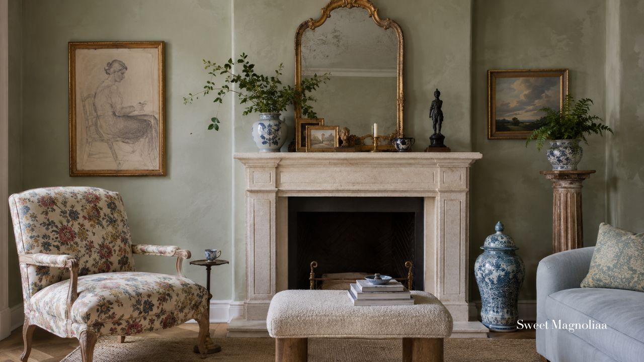
Sage also changes beautifully with its surroundings. Against warm oak, it feels richer. Beside limestone, it becomes softer. With linen and cream, it feels quiet and relaxed. Add terracotta, dusty rose, faded blue, or antique brass and entirely different dimensions begin to appear.
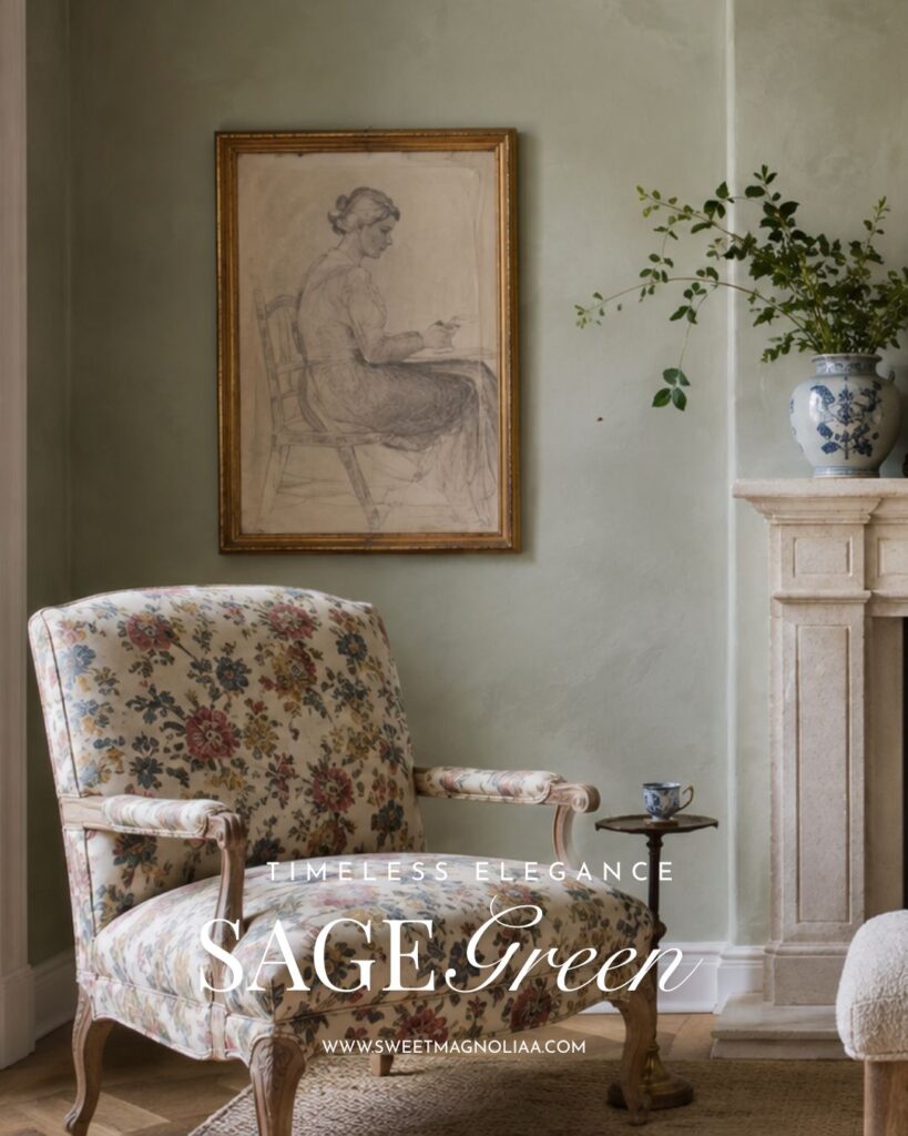
Perhaps most importantly, sage green allows a room to evolve around it.
Furniture can change. Artwork can move. Textiles can become warmer or lighter with the seasons. New antiques can be collected and old pieces can acquire more patina.
Yet sage can remain.
That adaptability is at the heart of its timeless appeal.
A Color Borrowed From Nature
The story of sage green begins outdoors.
Its muted tones recall herb gardens, olive leaves, eucalyptus, moss-covered stone, wild grasses, and foliage softened by distance and changing light.
These aren’t colors invented for a particular decorating season. They are colors we encounter repeatedly in the natural world.
And nature has an important quality that interiors often try to recreate: variation without visual chaos.
Look closely at a garden and very little actually matches. One leaf may be silvery green, another olive, another deep botanical green. Stone introduces gray and cream. Soil contributes brown. Flowers bring blush, lavender, yellow, blue, and burgundy.
Yet somehow everything belongs together.
Sage green brings a similar quality indoors.
It feels familiar without becoming predictable and colorful without becoming overwhelming.
This connection to landscape is one of the reasons sage has survived changing decorating fashions. Rather than belonging to a particular decade, it belongs to a much older visual language.
Nature doesn’t need to be reinvented every season—and neither does sage green.
Sage Green Sits Between a Color and a Neutral
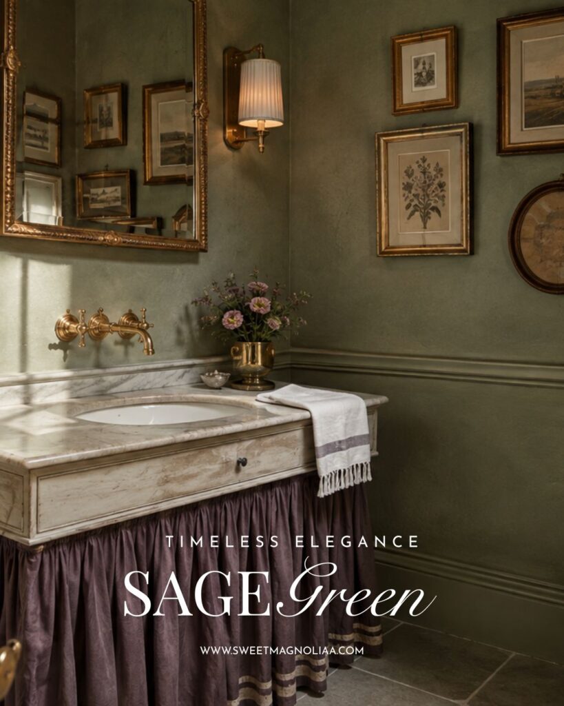
One of sage green’s greatest strengths is that it doesn’t behave entirely like a traditional color.
It has enough green to bring life into a room, but its gray and earthy undertones give it much of the versatility we normally associate with neutrals.
That balance is surprisingly useful.
A vivid green wall immediately becomes a statement. Everything else in the room must respond to its intensity.
Sage is quieter.
It can cover kitchen cabinetry, built-in bookcases, walls, shutters, or a substantial piece of furniture without necessarily becoming the entire story of the room.
Instead, sage often becomes a backdrop against which other colors and materials become more interesting.
Warm wood looks richer.
Cream becomes softer.
Brass appears warmer.
Stone feels more organic.
Blue-and-white pottery becomes clearer.
Pink flowers become more delicate.
Terracotta becomes earthier.
This ability to support rather than dominate gives sage much of its longevity.
The Undertone Changes Everything
Of course, there isn’t just one sage green.
Some shades contain noticeably more gray.
Others lean toward olive.
Some are pale and almost silvery, while deeper sages can become rich and enveloping.
These subtle differences dramatically change the atmosphere.
A gray sage can feel mineral, quiet, and restrained.
A warm olive sage feels earthy and sun-softened.
A pale sage can make a room feel airy and botanical.
A deeper sage introduces greater intimacy and works particularly well alongside darker woods and aged metals.
This is why choosing sage green should involve more than selecting a paint chip labeled “sage.”
Look at the architecture of the room.
Consider the flooring.
Notice existing wood tones.
Observe the amount and direction of natural light.
Then choose the version of sage that belongs naturally within those surroundings.
The question isn’t simply:
Does sage green work here?
It is:
Which sage green works here?
Sage Green Creates Depth Without Demanding Attention
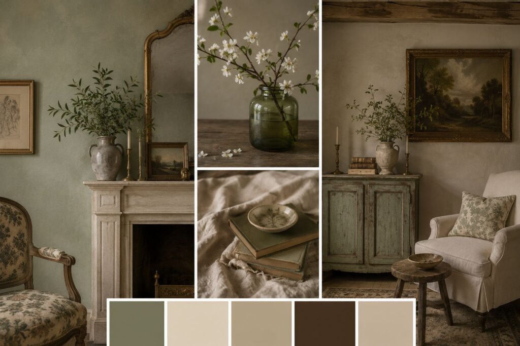
Timeless interiors rarely reveal everything at once.
Their beauty is often discovered gradually.
You notice the grain of an old wooden table.
Then the irregular glaze of handmade pottery.
Then the faded colors of a painting.
Then the patina on an old brass candlestick.
Then the way afternoon light changes the wall behind everything.
Sage green works beautifully in these rooms because it doesn’t need to compete with those details.
Instead, it creates visual depth behind them.
Imagine a room decorated entirely in beige and cream. It may feel serene, but without sufficient differences in texture and tone, the palette can become flat.
Introduce sage and the room changes.
There is now recognizable color, yet the overall atmosphere can remain calm.
The contrast is gentle rather than dramatic.
It Allows Other Objects to Tell the Story
This is particularly valuable in a collected home.
Against sage green, an old oil painting can appear richer.
Dark wood gains warmth.
Antique brass develops greater presence.
Blue-and-white porcelain looks fresh.
A bowl of apricots introduces warmth.
Pale roses become romantic.
Terracotta pottery feels grounded.
Books, baskets, textiles, ceramics, and artwork all have room to contribute their own colors.
Sage becomes the quiet thread connecting them.
It Doesn’t Need to Be the Main Event
Some colors work best when the entire room is designed around them.
Sage doesn’t require that level of commitment.
It can be important without becoming dominant.
A sage-painted cupboard may be enough.
So might a bank of kitchen cabinetry, one wall, a linen armchair, a vintage dresser, or a collection of botanical textiles.
This gives the color remarkable staying power.
The room can continue evolving while the sage remains quietly underneath it all.
And that may be one of the clearest signs of timeless design:
the foundation allows change rather than resisting it.
Sage Green Loves Natural Materials
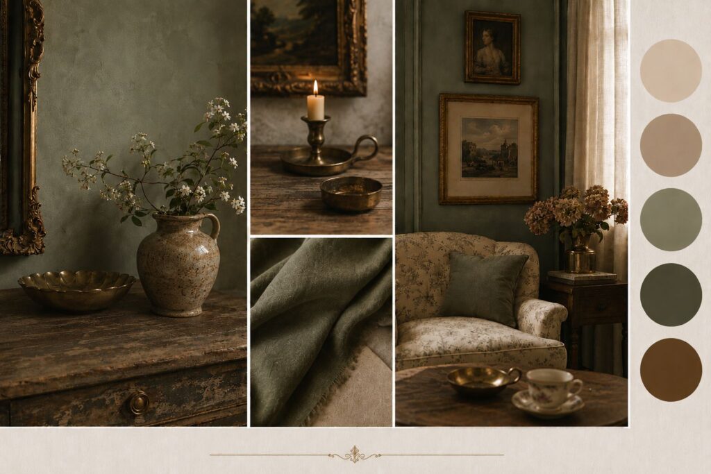
Sage becomes especially convincing when surrounded by materials that possess their own natural variation.
Think beyond color for a moment and consider surface.
The irregular grain of oak.
The coolness of limestone.
The softness of washed linen.
The rough weave of wicker.
The imperfect glaze of pottery.
The changing patina of copper.
The warmth of old brass.
These materials don’t have perfectly uniform colors, and that is precisely why they work so well with sage.
Sage Green and Wood
Wood is one of sage green’s most natural companions.
Pale oak can make sage feel lighter and more contemporary, while walnut and darker antique woods introduce richness.
Weathered timber creates a softer, rustic relationship.
Because green and brown already coexist throughout nature, the pairing rarely feels forced.
Sage Green and Stone
Limestone, marble, travertine, slate, and aged stone introduce mineral tones that emphasize sage’s gray and earthy undertones.
Warm stone makes sage feel softer.
Cooler stone can reveal more of its botanical green.
Sage Green and Linen
Cream, oatmeal, flax, ivory, and natural linen prevent sage from feeling heavy.
Their softness also creates an important contrast with harder materials such as cabinetry, stone, and metal.
Sage Green and Aged Metals
Brass and copper introduce warmth without requiring another major color.
Polished metal can look beautiful, but aged finishes are particularly effective because their patina echoes sage’s muted character.
The overall effect is layered rather than pristine.
Sage Green Changes Beautifully With Light
A truly interesting interior color rarely looks identical from morning until night.
Sage green is particularly responsive to light.
In clear morning light, its botanical qualities may become more noticeable.
Under warmer afternoon sunlight, earthy and olive undertones can emerge.
On an overcast day, gray-green shades can become quieter and more mineral.
By evening, warm lamps and candlelight can soften sage into an almost neutral background.
That movement gives a room life.
Always Test Sage in the Actual Room
This is also why choosing sage from a small digital image can be misleading.
The same shade can behave very differently depending on:
- The direction the windows face
- The amount of natural light
- Flooring color
- Nearby wood tones
- Artificial lighting
- Surrounding wall colors
- The finish of the paint
Paint a generous sample and observe it throughout the day.
A sage that feels perfect at noon may appear considerably cooler in the evening.
The best shade isn’t necessarily the prettiest sample in isolation.
It is the one that responds most beautifully to your room’s light.
Sage Green Works Through Every Season
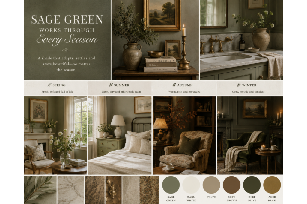
Some colors become strongly associated with one part of the year.
Sage is unusually seasonal without being season-specific.
Instead of changing the foundation, you can change what surrounds it.
Spring
Pair sage with flowering branches, blush pink, lavender, fresh cream, and delicate botanical prints.
The room immediately feels lighter and more romantic.
Summer
Introduce abundant greenery, natural linen, wicker, pale wood, and fresh garden flowers.
Sage becomes fresh and botanical.
Autumn
Bring in terracotta, rust, honey, ochre, walnut, copper, and deeper floral shades.
Suddenly the same sage feels warmer and earthier.
Winter
Layer cream wool, dark evergreen foliage, antique brass, candlelight, deeper woods, and tactile textiles.
Sage becomes restful and enveloping.
This ability to move through the year without requiring a complete redesign is another reason it remains such a practical long-term color.
Sage Green Creates Calm Without Becoming Colorless
There is a reason so many restful interiors rely heavily on neutrals.
Reduced visual contrast can create a sense of calm.
But an entirely neutral palette isn’t right for everyone.
Some people want tranquility and color.
Sage occupies that middle ground beautifully.
It brings the visual familiarity of green into a room while its muted undertones reduce intensity.
The result can feel restful without becoming sterile.
This makes sage particularly effective in spaces where comfort matters: bedrooms, kitchens, reading corners, living rooms, home offices, and quiet transitional spaces.
The color doesn’t need to announce itself every time you enter.
It simply contributes to the atmosphere.
Sage Green Ages Gracefully
Timelessness isn’t only about how something looks when it is new.
It is also about how gracefully it accommodates age.
Sage works particularly well with interiors that aren’t meant to remain pristine forever.
A painted cabinet can develop gentle wear.
Brass hardware can darken.
Wood can become richer.
Linen can soften.
Pottery can accumulate alongside newer pieces.
Furniture can move.
Artwork can change.
Instead of making these signs of life feel out of place, sage often becomes more convincing beside them.
It Doesn’t Demand Perfection
This matters because homes are not static photographs.
They are lived in.
Rooms acquire objects.
Surfaces develop character.
Tastes evolve.
Families change how spaces are used.
A successful long-term palette should have enough flexibility to absorb some of that change.
Sage does.
It can coexist with something antique and something new, something refined and something rustic.
That makes it especially well suited to homes designed to evolve rather than be completed all at once.
MORE ON SAGE GREEN
The Best Colors to Pair with Sage Green in French Cottage Interiors
Sage Green French Cottage Interiors: Timeless Decorating Ideas
Why Sage Green Continues to Work
When all of these qualities are considered together, sage green’s longevity becomes easier to understand.
It is rooted in nature.
It sits comfortably between color and neutral.
It works with warm and cool undertones.
It complements natural materials.
It responds beautifully to changing light.
It moves easily through the seasons.
It creates calm without eliminating color.
And it allows furniture, textiles, artwork, and collections to evolve around it.
None of those qualities depend on a particular decorating trend.
That is the difference between a color that happens to be fashionable and a color with genuine staying power.
MORE ON COTTAGE DECOR
English Cottage Style in a Romantic London Townhouse
English Cottage Fall Decor Ideas with Dark Academia Charm
Coastal Cottage Decor Ideas Inspired by Mediterranean Homes
10 Common Mistakes to Avoid When Decorating With Sage Green
Sage may be forgiving, but it isn’t impossible to get wrong. A few thoughtful decisions can make the difference between a room that feels naturally layered and one that feels flat or overly coordinated.
1. Choosing the Wrong Undertone
Not every sage works in every room.
A cool gray sage may become dull in a dark north-facing space, while a strongly olive sage may appear much warmer than expected in afternoon sunlight.
Always test the actual color in the actual room.
2. Ignoring Natural Light
Sage changes considerably with light.
Observe your sample in the morning, afternoon, and evening before committing to cabinetry or an entire room.
3. Pairing Sage Only With Stark White
Bright white can create more contrast than you expect.
For a softer palette, experiment with ivory, warm white, cream, oatmeal, flax, or natural linen.
4. Using Exactly the Same Green Everywhere
Matching every cushion, wall, cabinet, and accessory can flatten the room.
Allow variation.
Sage, olive, gray-green, botanical green, and naturally occurring foliage can coexist beautifully.
5. Forgetting About Texture
Color alone doesn’t create atmosphere.
Add linen, wood, stone, pottery, wicker, aged metals, artwork, and textiles to give sage depth.
6. Being Afraid of Other Colors
Sage doesn’t need to live inside a beige room.
Dusty blush, faded blue, apricot, lavender, honey, terracotta, ochre, burgundy, and cream can all create beautiful relationships with it.
7. Matching Everything Too Perfectly
Rooms become more interesting when objects appear collected rather than purchased as one coordinated set.
Let different woods, ceramics, textiles, and greens coexist.
8. Choosing the Wrong Finish
Highly glossy finishes can make muted sage feel sharper and more contemporary.
If you want a softer effect, consider matte, eggshell, limewashed, chalky, or gently aged surfaces where appropriate.
9. Forgetting the Existing Architecture
Don’t choose sage in isolation.
Flooring, stone, cabinetry, ceiling height, window direction, woodwork, and existing furniture should influence the shade you select.
10. Treating Sage Green as a Trend
Perhaps the greatest mistake is using sage simply because it is currently popular.
Instead, consider why you are drawn to it.
If you love its connection to nature, its quietness, and its ability to live alongside materials you already own, it can remain beautiful long after today’s decorating cycle has moved elsewhere.
Final Thoughts
Sage green’s enduring appeal isn’t really about popularity.
It is about adaptability.
It can be quiet without disappearing.
Colorful without becoming overwhelming.
Earthy without feeling rustic.
Elegant without requiring formality.
It welcomes wood, stone, linen, pottery, metal, flowers, books, artwork, and objects accumulated throughout everyday life.
And as those objects change, sage doesn’t necessarily need to.
In a decorating world that continually introduces something new, there is something reassuring about a color that doesn’t need constant reinvention.
Sage green doesn’t remain beautiful because it refuses to change.
It remains beautiful because it allows everything around it to change.
Perhaps that is why sage green never truly goes out of style.
It doesn’t follow fashion.
It follows nature.
And nature is timeless.
10 FAQs About Sage Green Interior Design
1. Is Sage Green Still in Style?
Yes, but its usefulness extends beyond whether it is currently fashionable. Muted green has an enduring relationship with natural materials and landscapes, which allows sage to work across changing decorating periods.
2. Is Sage Green Warm or Cool?
It can be either. Some sages contain cooler gray undertones, while others lean toward warmer olive or yellow-green tones.
3. What Colors Look Best With Sage Green?
Warm ivory, cream, dusty blush, faded blue, apricot, lavender, terracotta, ochre, burgundy, and natural wood tones can all work beautifully with sage.
4. What Neutral Colors Work With Sage Green?
Try warm white, ivory, oatmeal, flax, mushroom, limestone, soft beige, and natural linen.
5. Does Sage Green Work With Wood Furniture?
Yes. Sage works particularly well with oak, walnut, pine, reclaimed timber, and antique wood furniture. Different wood tones simply change the mood of the palette.
6. Can Sage Green Work in a Small Room?
Yes. Lighter sage shades can create a soft, restful atmosphere in smaller spaces. Pay particular attention to natural light and surrounding undertones.
7. Is Sage Green Suitable for Kitchens?
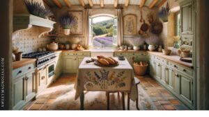
Sage is particularly effective on kitchen cabinetry because it introduces color while remaining easy to combine with stone, marble, wood, brass, copper, and neutral walls.
8. How Do You Keep a Sage Green Room From Looking Flat?
Introduce variation through texture, wood tones, stone, metals, patterned textiles, artwork, plants, and complementary colors rather than repeating one identical shade everywhere.
9. Should Sage Green Match Throughout the House?
Not necessarily. Related green tones can create continuity without every room using the exact same shade. Light and architecture may also call for different versions of sage.
10. Why Does Sage Green Feel Timeless?
Sage combines several enduring qualities: it is inspired by nature, behaves partly like a neutral, complements natural materials, responds beautifully to light, and adapts as a home’s furnishings change.